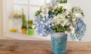
As we well know, Pantone set the tone for 2017 with their color of the year, Greenery. Pantone chose this color at the beginning of the year to evoke feelings of renewal and rejuvenation. Since then, we’ve seen many variations and reactions to the color and how flowers, fashions, and other trends have been working with “nature’s neutral.”
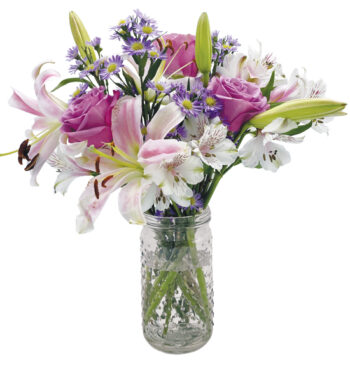
Another example of Pantone’s influence over the spring flower color trends this year is the uptick in popularity of softer, more subdued tones that are meant to relax and rejuvenate. Welcoming shades of light pinks, buttery yellows, and other muted colors are creating more neutral palettes. As we fully immerse ourselves in spring, we’re beginning to see how the popular floral trends predicted earlier in the year are beginning to play out.
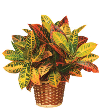
Seeing Green
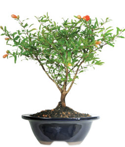
There’s no better time to celebrate the color of green than spring. The spring season is the right time to begin to revive from the heavy weight of winter and recharge with refreshing tones of greens and blues. Revel in greenery and related colors like blues and aquas that give off a serene sensibility. Related to harmony and balance, marine-like blues and natural greens are always widespread during the springtime but particularly so this spring.
Bright Eyes
But to offset having too soft a palette, bright colors are also having their day in the sun as coral and peach tones also appear to be popular this season. These perkier reds and oranges help strike a balance as bright pops of color make a neutral backdrop shine. Coral colors, particularly as the weather warms, add a liveliness that is fun and feels good to look at as we celebrate the energy and enthusiasm of spring and summer.
Comeback Kid
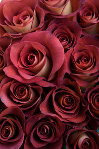
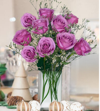
Dusty Rose, a muted pink, was a popular 80’s color some of us may recognize. While many have been touting the praises of Millennial Pink these days, Dusty Rose is a classic making a comeback. This soft pink feels neutral enough to pair with just about anything but also stands out on its own. Pinterest has noted that it is one of the most sought after colors in their 2017 wedding trend report. Like the name connotes, many roses come in a lovely shade of dusty pink that will suit anybody’s fancy as we enjoy all things pink.
Red, Red Wine
On the opposite end of the spectrum, deep, burgundy reds are also returning to the spotlight. The richness of these colors work perfectly with the lighter, muddier hues that are also so popular right now. Deep, jammy reds make a direct contrast to softer shades, like we can see in Leonidas roses, strike a delicate balance in floral design.
These trends towards neutrals with sharper, bright accents is a wonderful springboard to produce personalized touches to bouquets or flower arrangements. In a season of change and reinvigoration, what could be better than adding your own voice to the popular color trends of the season? Your own unique additions and flourishes make sending floral gifts or creating flowers for a memorable event truly special and make an everlasting mark.

